
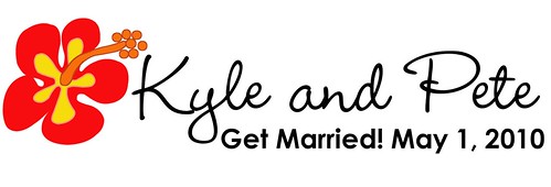
Different take on the logo:

Flower is a little different than the other day:
Possible cermony/reception locations.
Well, our dream is Hawaii, second place would be in my side yard with subs & cupcakes but my side yard doesn't hold 15 people much less 150. I really want something more like a backyard party and less like a gold-plated, chair covered, chair bowed, cookie cutter wedding palace. So here are some places we'll visit this weekend:
Oak Tree Lodge: in my hometown; is an outdoor picnic place (covered but not enclosed); has mini golf; we could have the hula show by the pool!! Cheapest option.
The Mill at Spring Lake Heights: if it winds up being in the winter; is on a lake; is a wedding palace but is fairly cheap compared to other wedding palaces.
Sandy Hook: ceremony on the bay and reception under a tent; kinda pricey but is on the water; ceremony and reception all in one place.
South Wall Banquet Facilities: basically the firehouse (but a nice one) for the ceremony; get married on the beach first then have reception at the firehouse; have more to manage with this one as far as catering, etc.
Opinions???
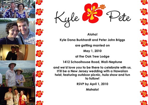
Let me preface these suggestions by saying that I'm not sure any of these would look good, but if it were my logo/ invite/ etc. I would try these for the invite:
ReplyDelete1. Either take out the twin columns of hibiscus or substitute another, simpler graphic. The little flowers make the piece busy and I have a hard time focusing on the words (which are smaller and b&w) and the photos (which are adorable and should get more focus, I think).
2. Try a thinner font for the body.
3. Add a white border around/ between the photos.
4. The piece is very 2-d; how about adding some depth with a shadow behind the hibiscus, or layering some elements, like the names ever-so-slightly on top of the hibiscus? Making the hibiscus into a gigantic watermark in the background, dropping the Kyle and Pete up top, and varying the size of the body font to emphasize your names more?
I am realizing you may be asking for opinions on ceremony and reception locations and not on the logo/ invite. And you may have tried all these things I suggested and didn't like how they turned out. Soooo just ignore this if any of that is the case. ;)
I love it. The colors are great. And I really like the photos on the side! I also like Antoinette's suggestion of making the large hibiscus into a watermark behind wording at the top - though how you would do this I'm not sure - fade the colors?? I also prefer the logo with the "and" written out. But all of this is my personal preference, of course and you may have a different vision. I, of course, like the idea of the beach for the ceremony (but that's also a bit of a problem because you don't know what the weather will be like). Otherwise, all of the venues for the reception sound similar to me right now. I bet you'll have a better idea after you visit them this weekend. You might just see one and "know" instantly.
ReplyDelete